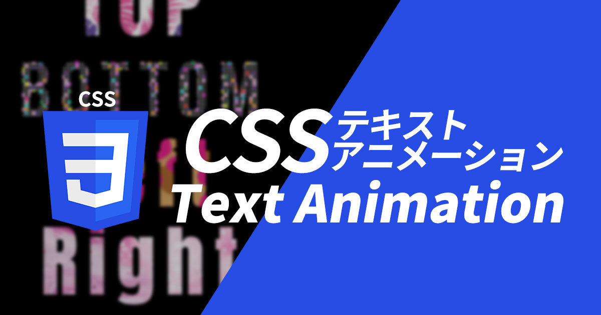
テキストに背景画像を適用しアニメーションキーフレームを利用して4つのテキストをそれぞれ異なる方向にアニメーションする方法を紹介します。
テキストアニメーションDEMO
まずは実装内容を確認しましょう、DEMOページをご覧ください。
See the Pen CSS Text Animation by SOLLUNA (@ygi) on CodePen.
下から上
See the Pen CSS Text Animation TOP by SOLLUNA (@ygi) on CodePen.
.top {
    top: 20%;
    background-image: url(イメージ);
    background-size: auto 200%;
    animation: flow 8s linear infinite;
}
@keyframes flow {
    from {
        background-position: center 0;
    }

    to {
        background-position: center 200%;
    }
}
animation: flow 8s linear infinite;アニメーションの名前、持続時間、タイミング関数、繰り返し回数順です。
flow@keyframesルールで定義されています。
8sアニメーションは8秒間続きます。
linearアニメーションが始めから終わりまで同じ速度で進行することを意味します。
infinite アニメーションが無限に繰り返されることを意味します。
@keyframes アニメーションの開始状態fromと終了状態toを定義しています。
開始状態では、背景位置はbackground-position: center 0;です。
終了状態では、背景位置はbackground-position: center 200%; になります。
これにより、背景画像が上から下に移動するアニメーションが作成されます。
上から下
See the Pen CSS Text Animation BOTTOM by SOLLUNA (@ygi) on CodePen.
.bottom {
    top: 20%;
    background-image: url(イメージ);
    background-size: auto 200%;
    animation: flow-reversed 8s linear infinite;
}

@keyframes flow-reversed {
    from {
        background-position: center 200%;
    }

    to {
        background-position: center 0;
    }
}
左から右
See the Pen CSS Text Animation LEFT by SOLLUNA (@ygi) on CodePen.
.left {
    top: 20%;
    background-image: url(イメージ);
    background-size: 200% auto;
    animation: flow-left 8s linear infinite;
}

@keyframes flow-left {
    from {
        background-position: 200% center;
    }

    to {
        background-position: 0 center;
    }
}
右から左
See the Pen Untitled by SOLLUNA (@ygi) on CodePen.
.right {
    top: 20%;
    background-image: url(イメージ);
    background-size: 200% auto;
    animation: flow-right 8s linear infinite;
}
@keyframes flow-right {
    from {
        background-position: 0 center;
    }

    to {
        background-position: 200% center;
    }
}